Now a days basic image editing tools are present on everyone’s device.Everyone likes to edit their photos in order to make it look more good before putting it up on social networking or sharing it with others. Here I talk about the basic tools which you should know about before you use them.
- CROP TOOL:- One of the the most overused tool in image editing is crop tool. Everyone uses this tool to remove the unwanted part of the image. But this tool is much more than that , it can help us to focus on a part of the image that you want your public to see. One such concept that you should know if u want to make your images much more interactive and bring in that ‘Wow’ factor is the “RULE OF THIRDS”.
RULE OF THIRDS:- We can divide an image into two parts an object (or subject) and background.We always want to have a communication between object and background to make the image look more dynamic. Now normally we try to take the object in the center of the background in our image and that is where we fail to make our communication between object and background and miss on ‘Wow’ factor.
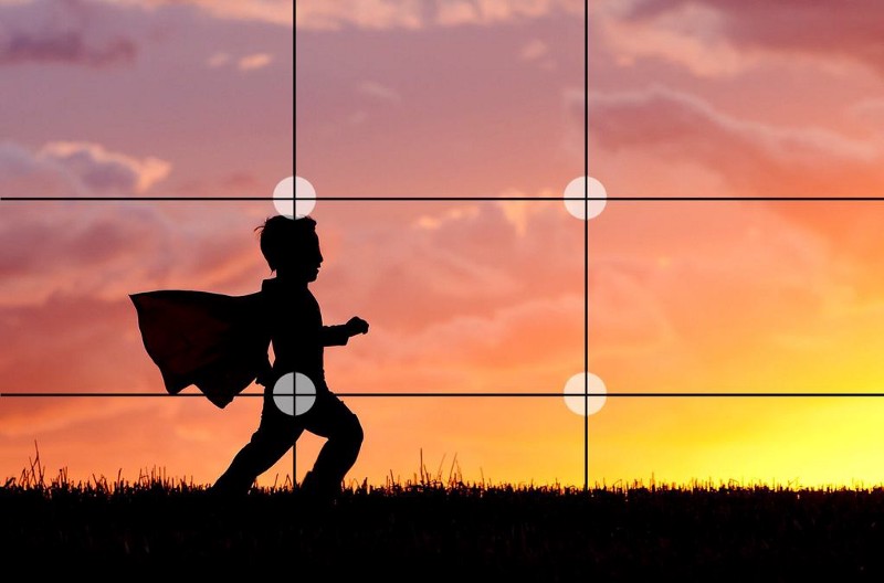
According to rule of thirds…every image can be divided into 9 parts like in the above image. In the above image our subject is the boy and the rest of the image is our background. In order to make your image more interactive we need to place our object(subject) on four dots instead of center that is object should not fall on center square it should be aligned on the corners of center square.Now it is belief that by doing this a interaction between subject and background is build which makes the image more appealing to viewer eyes.
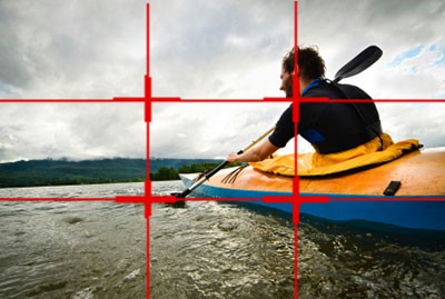
By using crop tool we can crop away the image from one side in order to make our object fall on one of those corners of center square.In actuality try to click the image such that it follows rule of thirds that is object lies on the corner of the center square. All the image editing tools are there only if you mess up with your image so if u miss this rule while clicking an image do not forget while editing it.
2. Brightness and Contrast:-An image consists of two shades bright ones and dark ones. Contrast is to make bright more brighter and dark more darker. This creates a contrast in image. Its makes parts of the image look more separate and distinguished. However one should not add more contrast to an image as it will start to look like broken pieces that is the image will separate out which will not establish any blend between object and background in an image.
If we talk more about contrast there are mainly two types of concepts in contrast:-
- Tonal Contrast:-Wonder why black and white images look better than colored one sometimes?? It is because it has very high tonal contrast and high contrast images pop out,show textures in the subject and give a feeling of edginess. High contrast is used lot in street photography and nature photography.So if you get a chance to capture an image with loads of pure black and pure white in it, go ahead increase its contrast.
- Color Contrast:-This concept will help you clear when to increase the contrast of image when not to. If you ever capture complementary colors(colors that are opposite in color wheel) in a single image go ahead increase the contrast of the image. If u captured analogous color(colors that are next to each other in color wheel) try to lower down the contrast of the image let the colors blend as they will not distinguish out on increasing the contrast unlike the complementary colors.
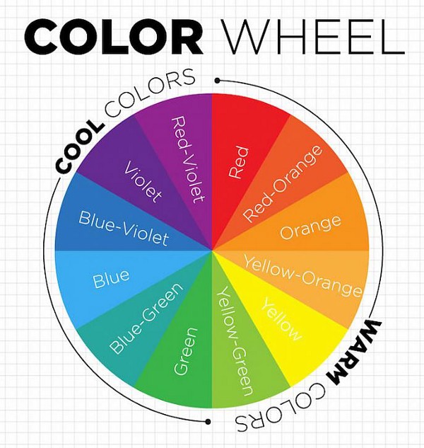
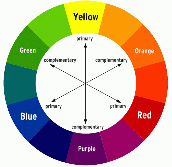
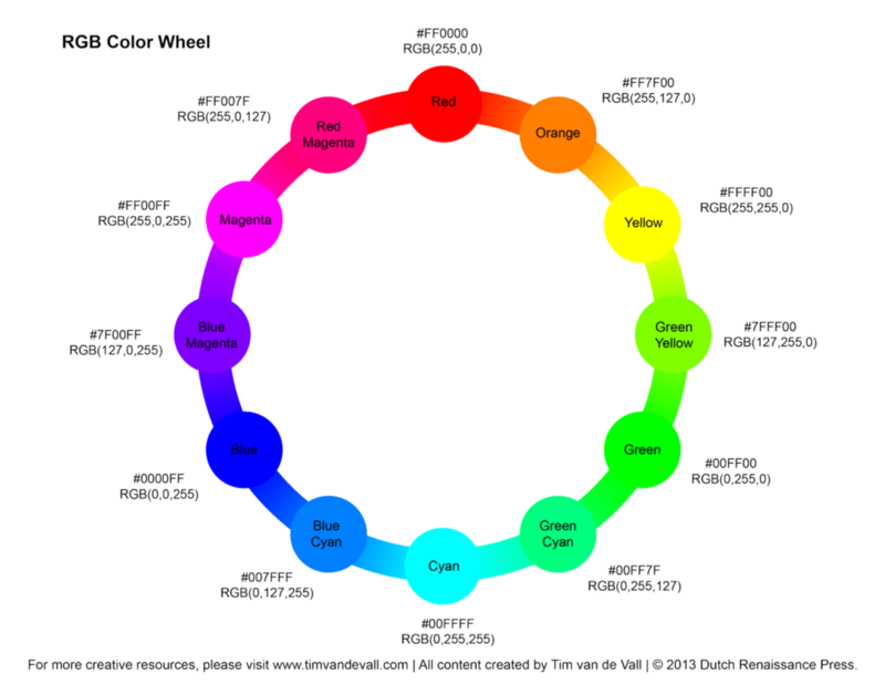
3. Hue:-Hue is a single value in an image that gives the details about the color of the image. Hue works on the principle of color wheel again.As we increase the hue of an image, color of the image tends to change . If hue is set to zero it means color is red and as we increase the hue, color tends to move clockwise according to the color wheel. It means if hue is set to 360 again the color that we will be seeing is red.
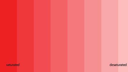
4.Saturation:- Saturation is again related to colors in an image. Saturation means how grayer the color is , lighter red would mean low saturation and more grayer (deeper) red color would mean high saturation
CONCLUSION:-
By using HSB:-
- Hue(H)
- Saturation(S)
- Brightness(B)
We can adjust color in the images.Hue will determine the type of the color , saturation will adjust the shade of the color and brightness will add depth to the color.
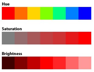
In our smart devices the applications that we get for image editing usually uses scroll bar or meter to adjust HSB. Increasing the hue makes the entire color of the image move towards the blue side , increasing the saturation will make the color more darker and less grayish and increasing the brightness will make the color less darker and more whiter. Whereas increasing the contrast of the image will make the complementary colors present in the image distinguished and will blend the analogous colors. So with the help of “Rule Of Thirds ” and HSB one can make an image more compelling to viewers eye.